Elements as containers for other elements
You can't go wrong with a grid of divs
Consider the code below. The idea is to have a container with some content on the left, some content in the middle, and some on the right. So, we...
- make an element for the entire area (the "container")
- make elements for the three sections within
- USE PROPER INDENTATION
<div id="my-container">
    <div id="my-container--left">
        ~ some content ~
    </div>
    <div id="my-container--middle">
        ~ some content ~
    </div>
    <div id="my-container--right">
        ~ some content ~
    </div>
</div>

<style>
    #my-container > * {
        padding: 10px;
    }
    #my-container--left {
        background-color: lightblue;
    }
    #my-container--middle {
        background-color: lightgreen;
    }
    #my-container--right {
        background-color: pink;
    }
</style>
But then it comes out looking like this...
That's because divs are block elements, and -- by default -- block elements will render vertically, because they don't want to share the line with other elements. But that's okay. We can add the following styles to the container:
<style>
    #my-container {
        display: grid;
        grid-template-columns: 1fr 3fr 1fr;
    }
</style>
Now it will look like this:
This defines #my-container as a GRID. The children of #my-container then automatically become GRID ITEMS.
What is "fr"?
fr stands for "fractional unit". Think of it like a "part" in a cocktail recipe. Have you ever seen a recipe like this before?
- 3 parts Bourbon
- 2 parts Sweet Vermouth
- 1 part Orange Liqueur
Now replace "part" with "fr". A "part" is not an absolute unit like cup, ounce, or millileter. It's a fractional unit. In the recipe example, the total sum of parts is 6. So that means the recipe is one-half bourbon, one-third vermouth, and one-sixth orange liqueur. In other words, 1fr 3fr 1fr is a ratio of 1:3:1. With the whole being 100% the width of the parent element. In even otherer words, it's 20% 60% 20%.
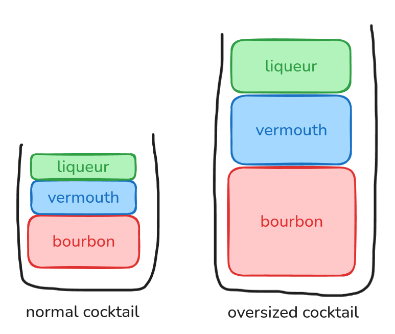
In the picture above, BOTH of the cocktails have a ratio of 3:2:1. Similarly, your GRID will maintain its ratio of 1:3:1 no matter what the width of the viewport is! It's responsive!